
Each year, the Dulux Colour Forecast offers a glimpse into the colours and design influences expected to shape Australian interiors. But beyond the individual shades, what we find most interesting is what these forecasts reveal about the direction of interior design more broadly.
For 2027, Dulux has introduced three distinct palettes: Sensory, Play, and Treasure. Together, they explore a move towards more personal and expressive interiors, each focusing on a specific family of shades — muted botanicals, playful pastels, and jewel tones.
It's a direction we've been particularly interested in at Alternative Surfaces. With the recent expansion of our X-Bond Hybrid Microcement range, including new shades from terracotta to olive to sandy golds, we're seeing more opportunities to explore colour through architectural surfaces.
Here's our take on the Dulux Colour Forecast 2027, and how we'd interpret its three palettes through material selection, texture, and contemporary interior design.
1. Sensory: The Soothing Power of Nature
Of the three palettes, Sensory feels particularly aligned with the design direction we've seen gaining momentum across contemporary Australian interiors.
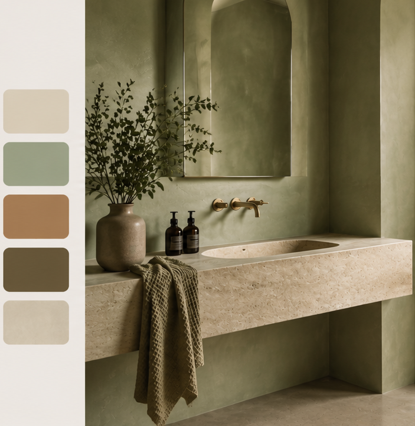
Inspired by Japanese craftsmanship and the importance of everyday rituals, the palette brings together organic tones — botanical greens, warm neutrals, and rich earthy browns — to harness the stillness and calm of nature.
Shades like Spinach Green, Field Maple, and Humble Fawn create a palette that feels grounded without relying on the usual combination of beige and white. We can see the expanded green and warm beige shades in our X-Bond Hybrid range working particularly well with this direction.
What stands out to us is the relationship between the colours. Rather than introducing strong contrasts, Sensory explores subtle differences and the way muted, tonal shades interact. For us, that's what makes it so interesting; demonstrating that a restrained palette can be layered and multi-dimensional.
Sensory is perhaps also the strongest example of why material selection matters as much as the colour itself. Creating a true sensory experience involves the tactile quality of a surface and the way textures behave.
With trowel-applied microcement, you can achieve variations in tonal movement and light reflection that introduce a soothing, enveloping quality to your surfaces. Learn More: What Does Microcement Look Like?
2. Play: Whimsically Sophisticated
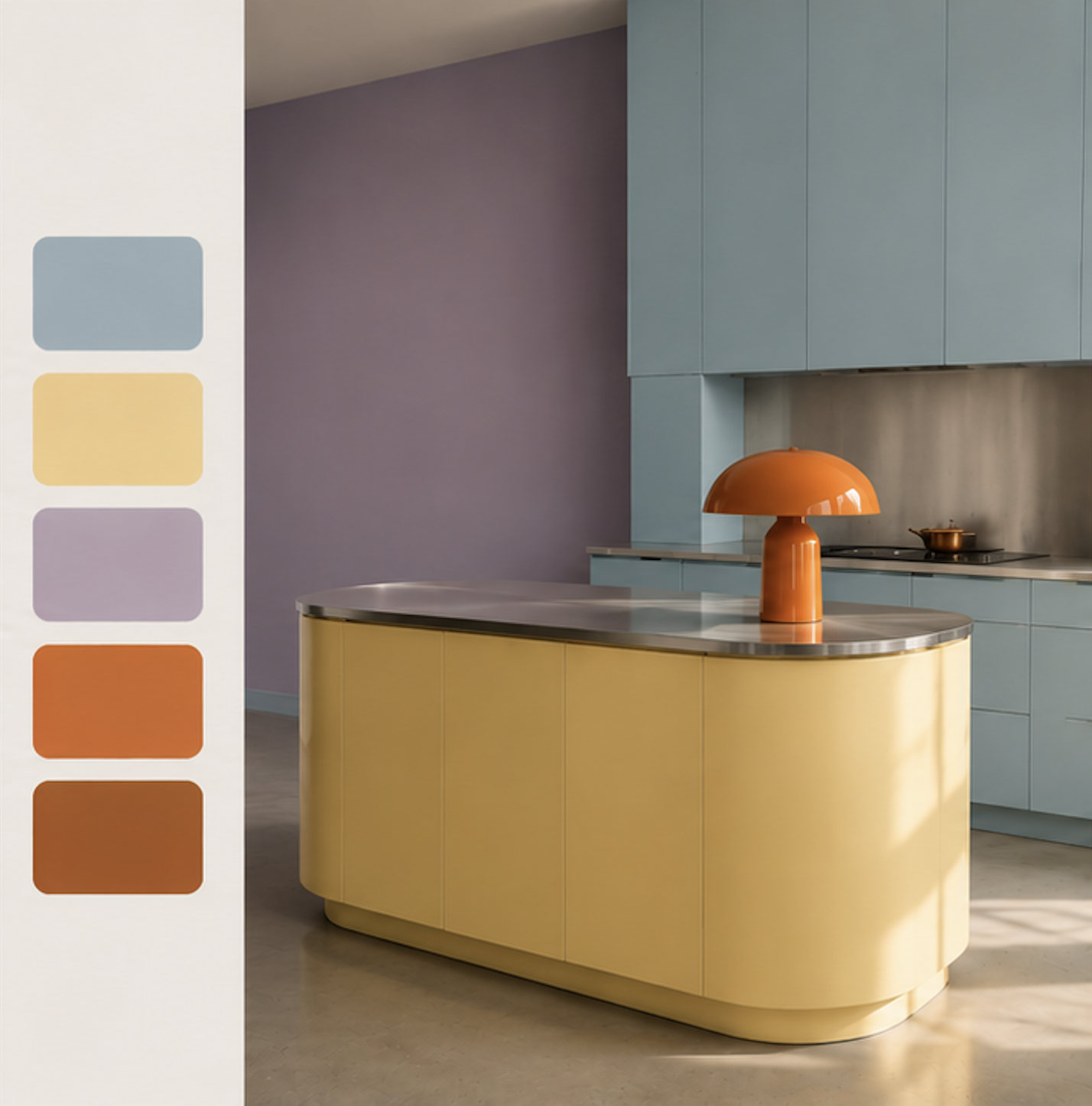
The Play family is built around pastels, both vibrant accents and deeper anchor tones. It embraces a more spontaneous and unexpected approach to colour, and works best with hyper modern designs rather than the heritage-inspired.
What we like about this direction is that it doesn't insist on every element belonging to the same colour family. Instead, the combinations feel deliberately eclectic. Among its featured shades are a fresh yellow-green, soft lilac, lively spearmint, rich burnt orange, and an array of soft blues.
Play challenges the idea that a cohesive interior needs to follow a strictly coordinated colour palette. Some of the most interesting spaces are those that bring together colours you wouldn't ordinarily think about. Dulux says it’s designed to stimulate “a sense of curiosity and creative expression”.
Read Next: Five Noteworthy Architectural & Design Trends from 2026
3. Treasure: Rich & Nostalgic
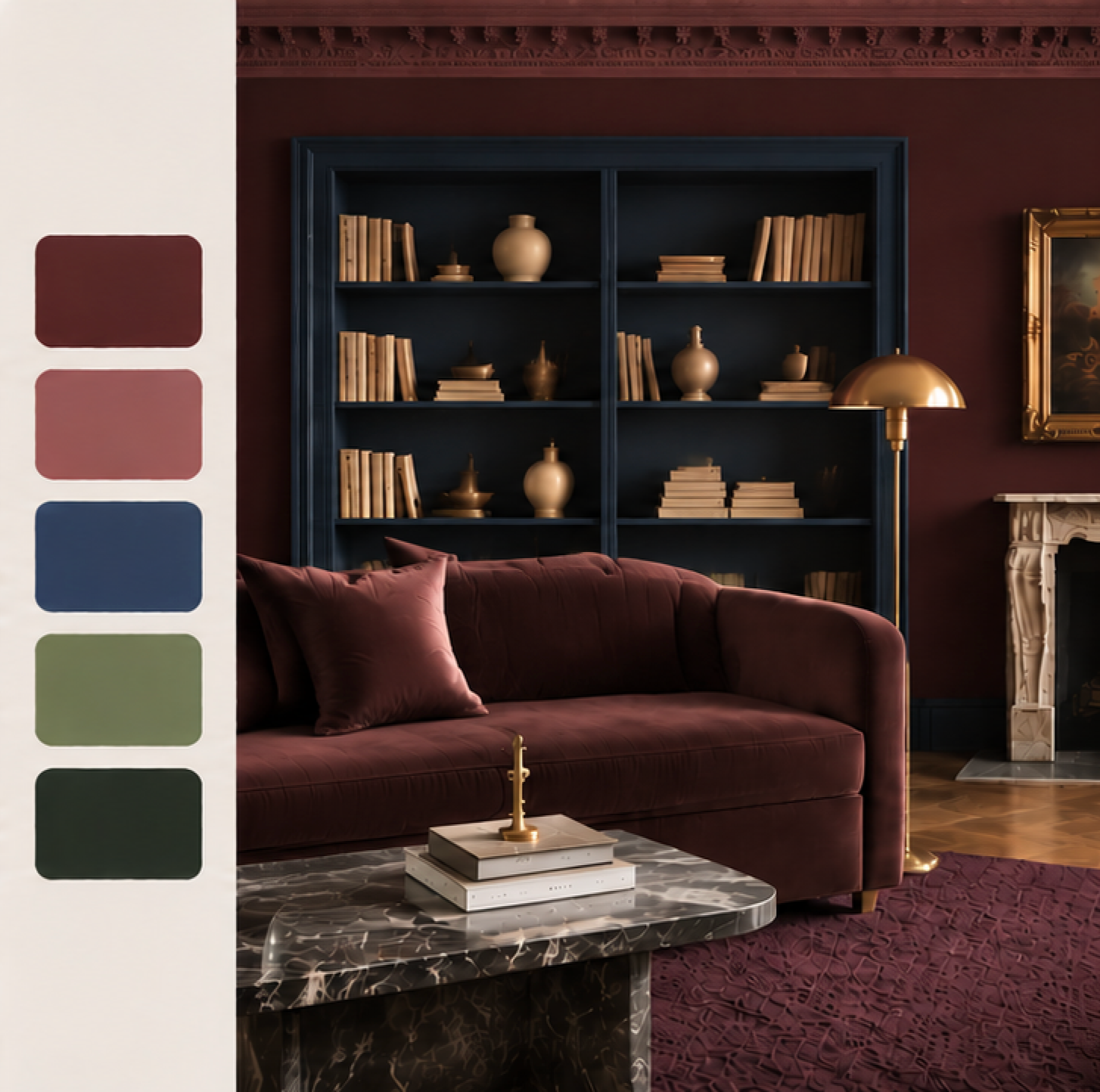
Treasure takes the forecast in a more dramatic direction that recalls vintage eras, storytelling, and collected objects. The palette's standout shades include jewel tones, lending itself to theatrical interiors with a sense of intimacy and opulence.
What we find interesting about Treasure is its departure from more understated colouring into bolder shades that feel particularly suited to spaces with heritage influences or a more eclectic approach to design.
Deep reds, golden hues, purple-blues carry a certain romanticism, and work particularyl well with period detailing and antique objects. However, we don't think Treasure needs to be interpreted through an entirely traditional lens. These colours can feel equally at home in contemporary spaces, where their richness creates an interesting contrast against cleaner architectural lines and more minimalist detailing.
Related Reading: The Principles of Timeless Home Design
What the 2027 Colour Forecast Tells Us About Interior Design
While Play, Sensory, and Treasure have different personalities, there's a common direction running through all three: a move away from designs that play it safe.
We don't interpret this as the end of minimalism or neutral interiors. Rather, it suggests a broader willingness to experiment with colour, introduce more personal combinations, and create spaces with a stronger sense of individuality.
As microcemet installers, we’re also interested in the role that texture plays in the presentation of these palettes. Colour isn't being considered in isolation. It's being expressed through tactile finishes — like X-Bond — that influence how a space looks and feels.
Unlike conventional paint, microcement introduces a cementitious texture with subtle tonal variation, allowing colour to interact with light and materiality in a whole new way.
Related Reading: Microcement Colour Schemes We Love
Exploring Colour With X-Bond Hybrid Microcement
The expansion of our X-Bond Hybrid Microcement range comes at an exciting time for architectural colour. With additional shades across terracottas, greens, yellows, and warm neutrals, the range offers designers more flexibility to explore colour within seamless, hand-applied finishes — as well as our custom colour matching service.
While trend forecasts provide valuable inspiration, we believe the most successful interiors are those that interpret these ideas in a way that suits the architecture, the people using the space, and the materials themselves.
The Dulux Colour Forecast 2027 is a particularly interesting starting point, not because it establishes a single look for the year ahead, but because it encourages a more individual approach to colour.