
The Rise of Monochrome Interiors
Why rooms designed around a single colour family are quietly replacing contrast-heavy specifications.
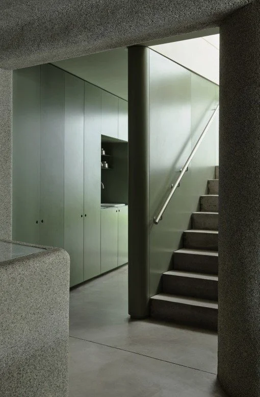
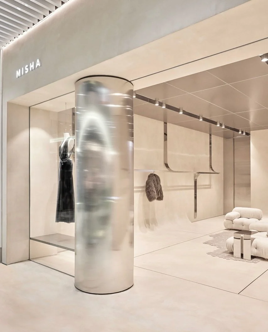
Where design once leaned on bold juxtapositions — dark against light, statement colours popping on neutral backdrops — contemporary spaces are becoming more tonally restrained. Instead of contrast, designers are exploring nuance in 2026. Interiors work within a narrow spectrum of colour, allowing subtle shifts in shade, light and material to shape depth.
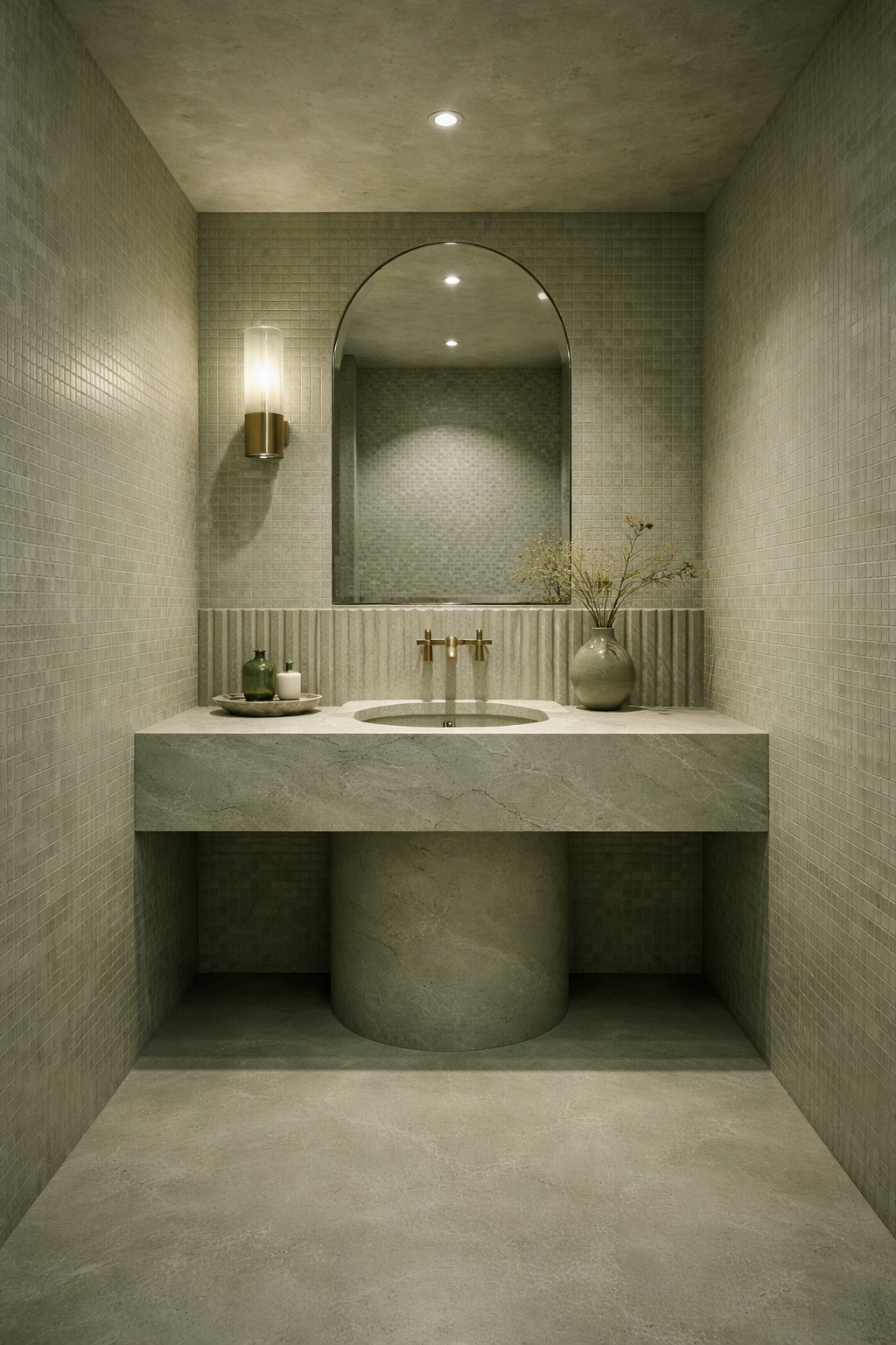
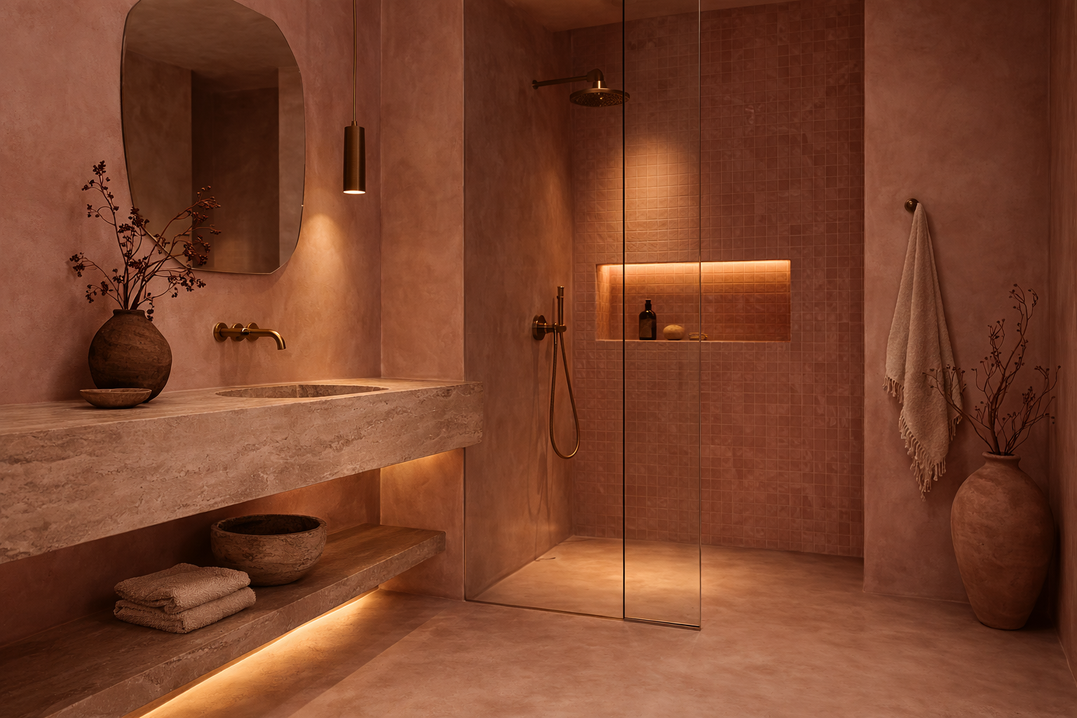
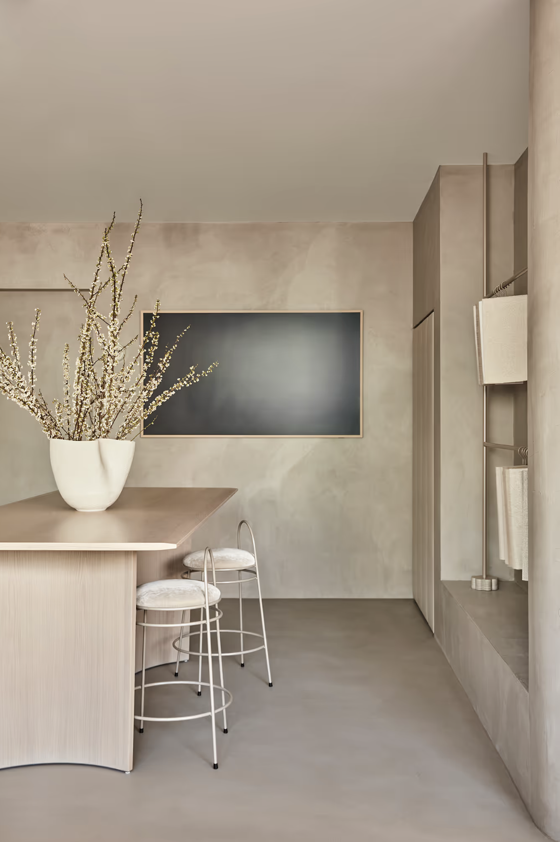
Let’s clarify something: when people hear monochrome they automatically think black and white, but monochrome doesn’t refer to an absence of colour. It involves the exploration of a single colour or tonal spectrum — different materials, surfaces or finishes all existing within the same family. Pink on pink, green from floor to ceiling, all-white everything.
The result is a softening of boundaries between elements, and a room that reads as a unified composition rather than a collection of seperate parts. Form, proportion and spatial rhythm become more legible when colour is not competing for attention. Volume and light become your decorations.
In this sense, tonal palettes align closely with architectural thinking. They prioritise clarity and restraint, allowing the structure of the space — rather than applied styling — to carry the visual weight.
Related Reading: Five Architectural & Interior Design Trends to Watch For 2026
The Role of Light, Shadow and Texture
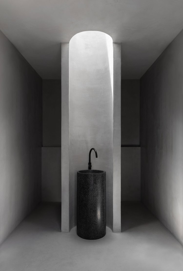
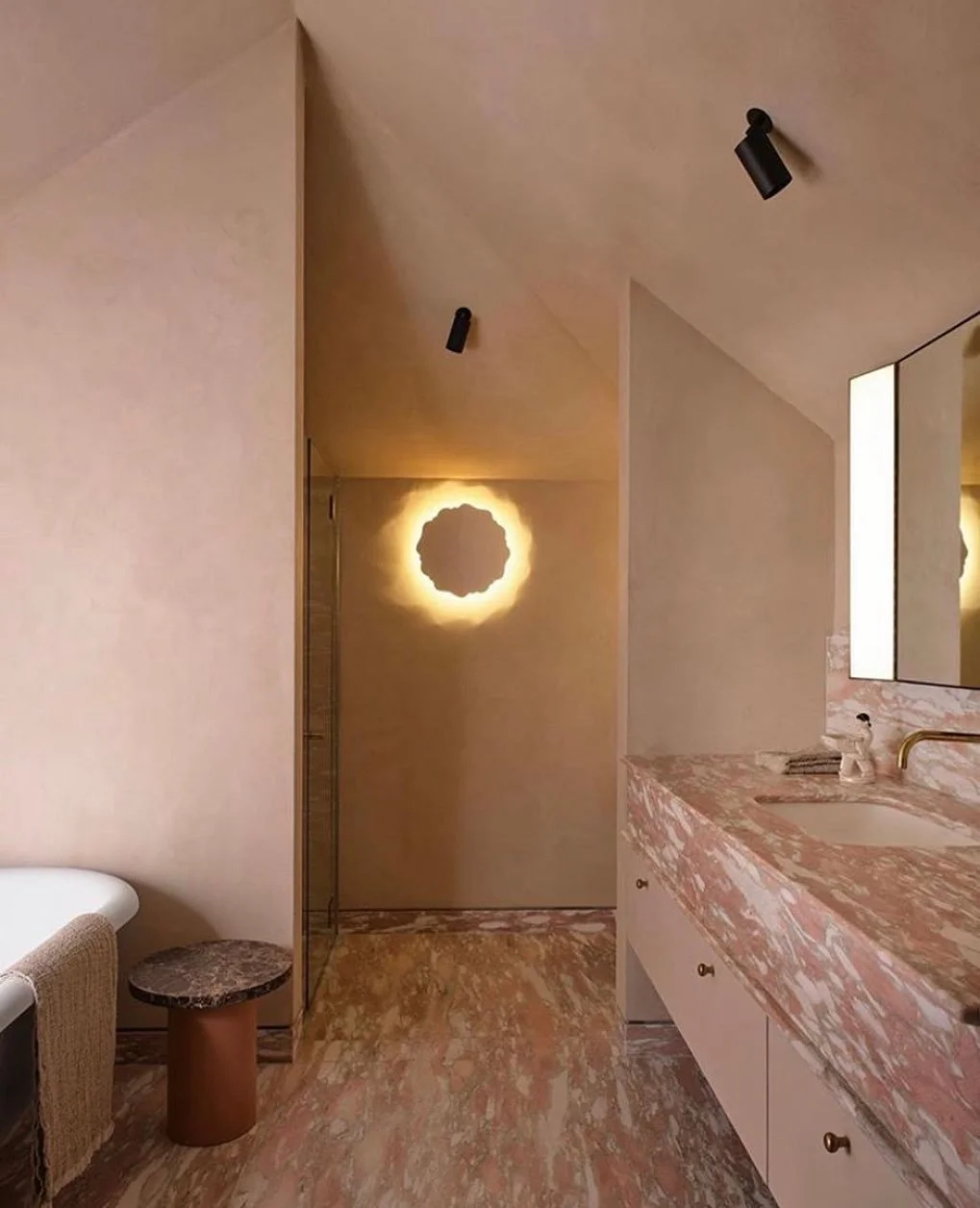
In tonal interiors, light becomes a main character. Whether introduced naturally through windows and skylights or artificially with fixtures, the interplay between illumination and shadow is a primary driver of variation.
Planes catch light differently depending on orientation and material. Light also evolves throughout the day, so architecture becomes responsive rather than static.
Don’t confuse monochrome for monotonous — it’s not boring or plain. Interest is built through a layering of materials and textures that share a similar hue, but express it differently. Natural fibres, stone, timber and rendered walls each carry their own subtle tonal shifts.
The palette remains restrained, but the material language is rich, and this is where tonal interiors gain their depth. Even within a single colour spectrum, a space can feel complex and atmospheric.
Related Reading: The Hottest Material Trends Right Now
Monochromatic Microcement
Materials that carry inherent movement are particularly suited to tonal interiors. Microcement is one of them.
Unlike painted surfaces, which tend to appear flat and uniform, hand-applied microcement reveals a gentle variation across its surface. The trowelling process leaves behind subtle shifts in tone and texture.
When used across walls, floors or architectural elements, microcement also allows for seamless surfaces. Without visible joints or interruptions, the material reads as a continuous plane, reinforcing the spatial clarity that tonal interiors depend on.
In this context, microcement functions less as a standard finish and more as an architectural surface providing quiet tactility to animate the space.
Related Reading: Microcement Colour Schemes
In 2026, single-tone palettes are becoming a defining language of interior architecture. Rather than relying on bold gestures, monochrome interiors invite attention to the subtleties — the movement of light, textural variation within materials, and the volumes of the architecture itself.
Read Next: What Pantone’s Colour of The Year Says About Design